How to use our Design Editor 2.0
Our Design editor 2.0 lets you create the content for your Clerk.io elements without coding.
Basics
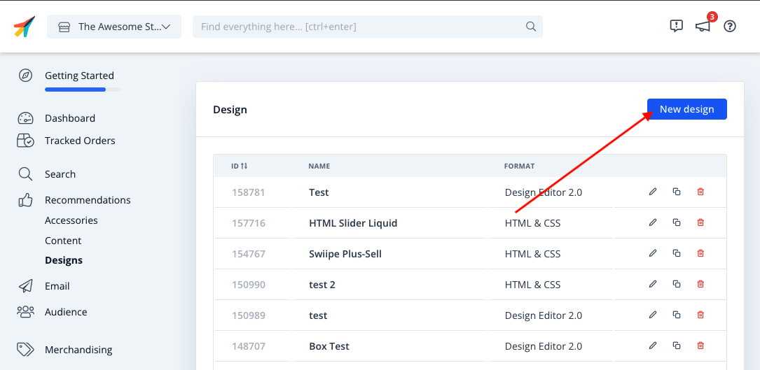
To use the New Design Editor, go to my.clerk.io and click on either Search or Recommendations and then Designs like you used to for the old one.
Click New Design:
From here you will be able to choose either to start with a template, or with a completely blank design:
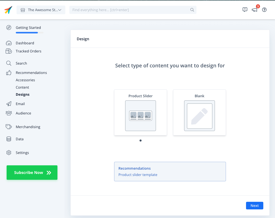
If you choose Blank you will be able to either create a design in the Design Editor or directly via code mode.
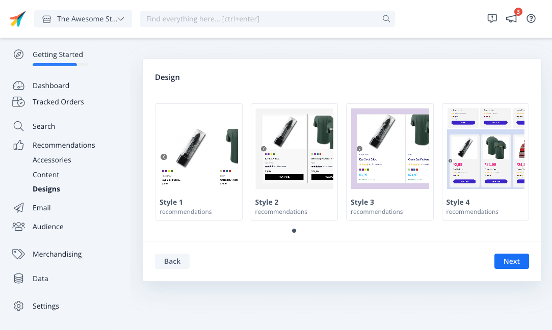
If you choose to go with a template, pick from one of the starting styles available:
Click Next, give your design a name, and then click Create Design.
You can now see the Design Editor as below:
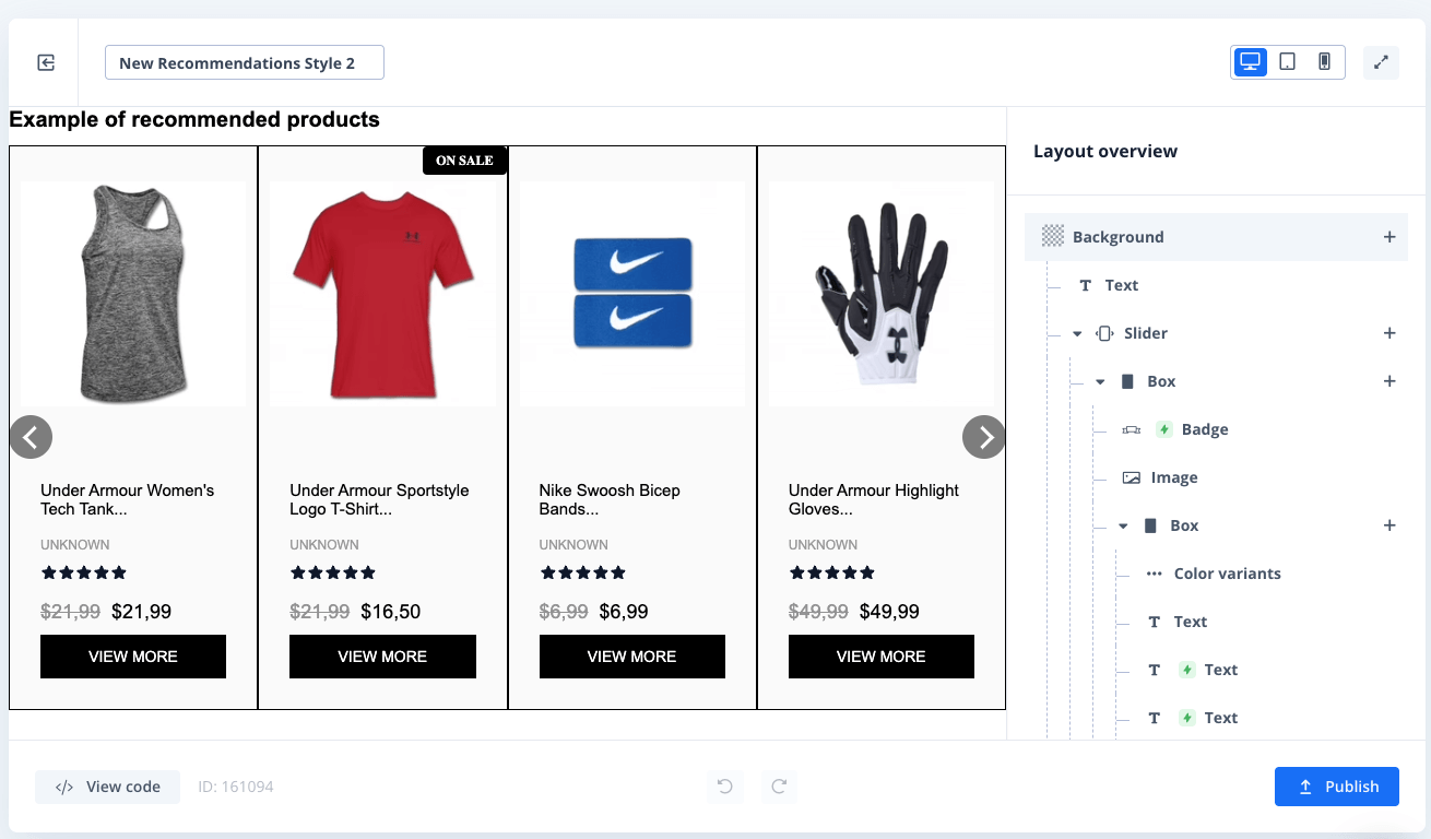
Next to your design title on the left top, you can choose to view the design and edit the styling specifically for Desktop, Mobile and Tablet - the styling will be used for each type of device.
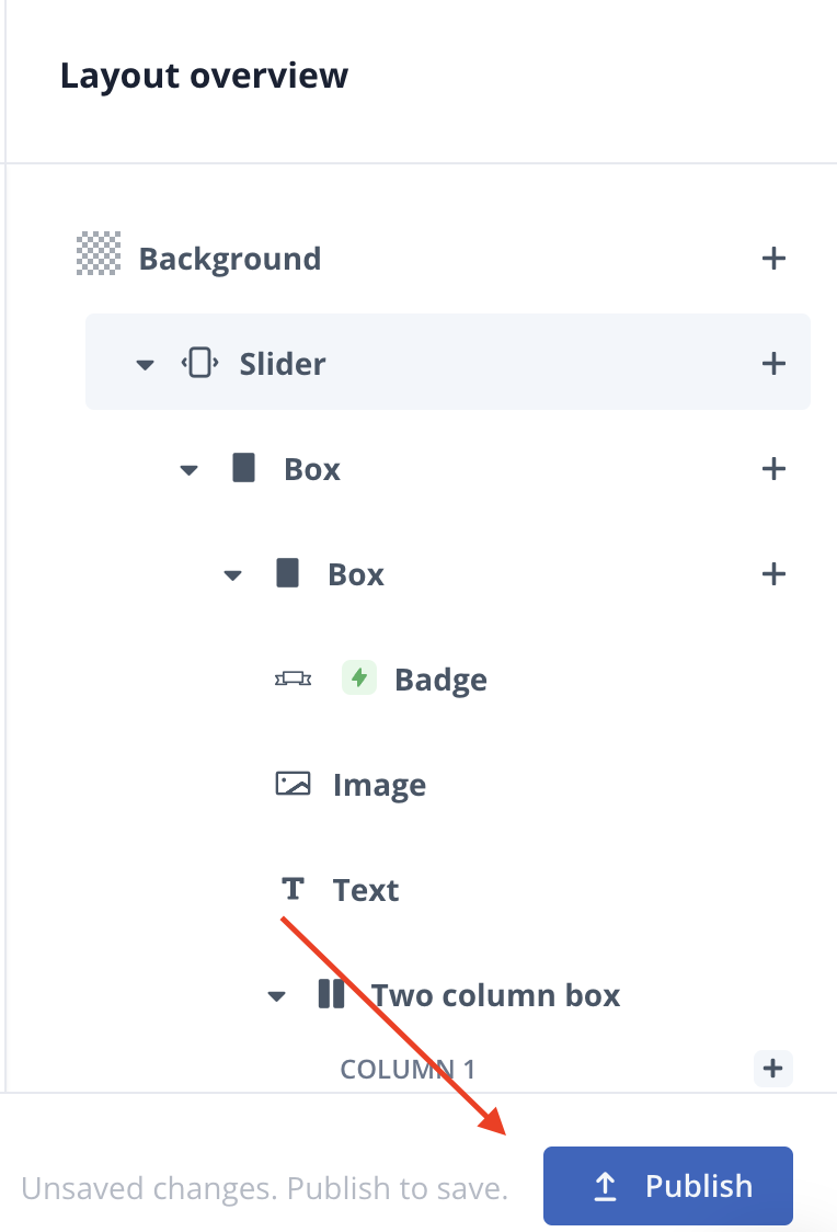
You will also find a "tree-view" collapsible menu on the right which displays all the elements you have included in your design.
- To modify an element of your design, click on it.
- to Delete an element, click on the bin icon next to the "+".
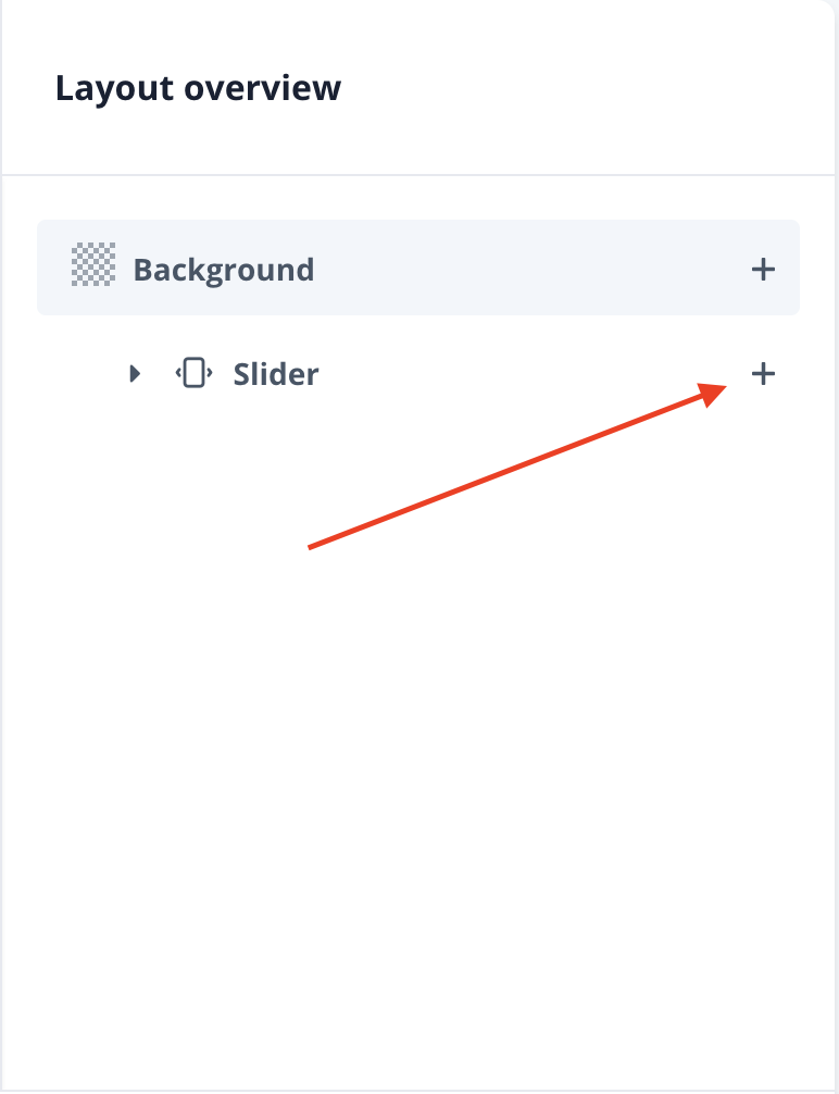
- If you want to add or change an element, click the "+" and you will have three different categories as shown below.
When you click on the "+" and add , it places the item inside the component that you choose to add from, becoming part of your "tree-view" structure.
Display Multiple
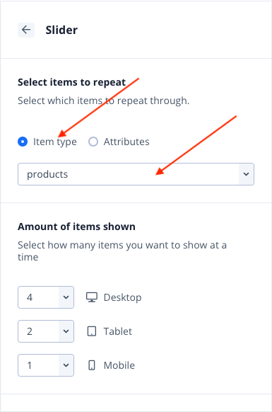
Display Multiple lets you choose different options to display your content in the design (e.g. Slider will show products on an horizontal line next to each other, Grid data list will show them in grids and so on)
When choosing the Display multiple item, make sure to click on it and click Select item to repeat By tapping libraries above and then choosing product for example, you will display all the products available in your catalogue.
Components
From this menu you can choose new elements for your Design. To reposition the element in the design, drag it from the right hand sided tree-view menu like below:

Layout
Layout has three different options (Box, Two Column Box and Three Column box).
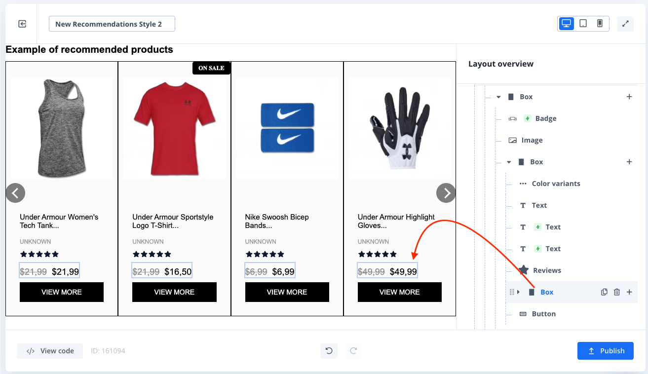
A box can be used to contain different elements in it.
For example, when showing a crossed out price for a product on sale and the actual discounted price, you will use a box with two columns, assigning the different price attribute to each one of the columns.

Conditional Display
Conditional Display allows you to show elements only when a certain criteria is met, like when a product is on sale, or if its not in stock.
To insert a condition, open one of your elements, like a badge in the example and type your attribute or condition in the box as shown below.
Conditional Display is optional, so if left empty on a badge for example, the badge will show on every repeated item in your design.
When using conditional displays, the syntax is always item.attribute as it can be used on all data types: products, categories, suggestions & pages.
Using item.attribute will use the data from whatever data is currently looped through.

Save and Publish
When you completed your design and are ready to use it on your store as a Clerk content, click on the blue "Publish" button on the right bottom side.
your design will now be saved and published with your old existing designs under Design and is ready to use in your Content.
For using it, do as you did previously with old design, under Content > Edit > Select Design.